How to read a trading chart

- How to read forex charts
- Understanding trends
- Types of trading charts
- Candlestick charts details
- Graphical Analysis
- Using Indicators and Studies on Your Chart
How to Read Forex Charts
Identifying trends, whether they are moving up, down or across and also knowing when they are about to reverse is really key to your Forex trading. No matter what asset you are trading, you need to know how to follow charts. The ability to read trading charts is part and parcel of trading, and the more you understand about technical analysis, the better a trader you can become.
Like all things in life, the more you practice, the more you enhance your skills. This article aims to kick you off on your journey to understanding and using charts to enhance your trades. Traders that use charts are known as technical traders. They prefer to follow the predictive powers of charting tools and indicators to identify peaking trends and price points, in order to guide them when to enter and exit the markets. On the other hand, fundamental traders prefer to follow news sources that offer information on economic growth, oil supply, employment data, interest rate changes and geopolitical drivers like war and political instability. Let’s start by understanding what a trading chart is, before zooming in on patterns and indicators. In short, a chart is a depiction of exchange rates that happen between two financial instruments that are plotted and illustrated on a graph.
Understanding trends
When you hear of a Bullish trend, you are looking at an overall upwards trend (imagine a bull charging) and a Bearish trend is a sequence of descending lows and highs (imagine a bear hiding in the woods). There is a third kind of trend that is known as the sideways, flat or horizontal trend, which moves across. A ranging market is when the price of the asset hits the same highs (resistance line) and lows (support line) at least three times in succession. It is said to be trading in a range. To learn more about identifying trends and the duration of trends, skip across to our Trend Trading Guide.
Types of trading charts
There are three main chart types that are popular among trading circles. Each chart type offers a variety of different information according to the traders’ individual skill level:
Line Chart – This is the most basic of trading charts, and the stepping stone for the beginner trader. This chart represents only a closing price over a period of time. The closing price is often considered the most important element in analysing data. This is in essence, how the line chart is formed: by connecting the closing prices over a set time frame. There is no visual information or trading range, meaning no highs and lows and nothing on opening prices.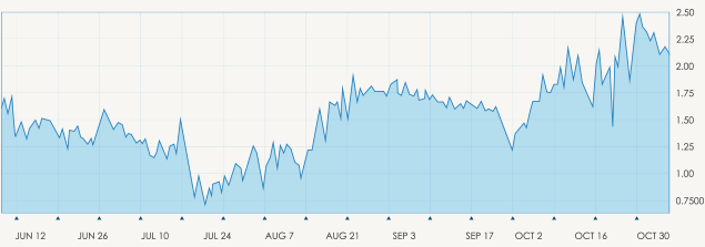
Bar Chart – Expanding in more detail on the line chart, the bar chart includes several more key fragments of information that are added to each data point on the graph. Made up of a sequence of vertical lines where each line is a representation of trading information. They do represent the highs and low of the trading period as well as the open and closing price. The open and the close price are represented by a horizontal shorter line. The open price is the ‘dash’ that is located on the left side of the vertical bar and conversely the close price indicated by a similar horizontal line, to the right side of the bar. Understanding this trading chart is simple, if the left dash (which is open price) is lower than the right dash (closing price) then the bar will be shaded in green, black or blue and represents a price increase and the instrument gained in value. The opposite is true and the decreased value of the stock is indicated in red.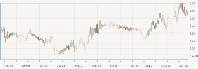
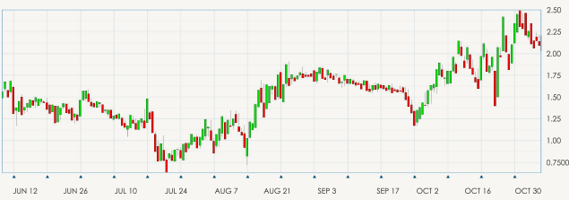
Candlestick Chart – Once you have mastered the line and bar charts, you can move on to the candlestick chart, which is similar to the bar chart. The vertical lines of both charts illustrate the trading period’s price ranges, while the body of the candle uses different colors to represent the market changes of that time period.
Candlestick Charts in Detail
Dating as far back as the 17th century, the Japanese began using technical analysis to trade on rice. Hence, the Japanese Candlesticks commonly in use today.
The data relayed from the candlestick includes the highs, lows, open and close prices.
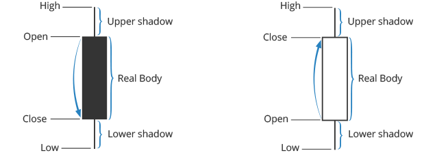
The ‘hollow’ and the ‘coloured’ portions are called the body. The long thin lines above and below the ‘body’ represent the high or low ranges and are also referred to as either shadows, wicks or tails. Should the lines be placed at the top of the body this will tell you the high and close price, while the line at the bottom of the graph indicates the low and the low’s close price. The colours of the candle body do vary from broker to broker, however they are usually green, illustrating a price increase, or red being a decrease in price.
A hollow candlestick is where the close price is higher than the open price, which will indicate to traders to BUY. Filled / coloured candlesticks where the close price is less than the open will indicate a SELL position. Long versus short bodies will indicate the BUY or SELL pressure among traders. Short bodies represent very little price movement and are often treated as a consolidation pattern, known as Doji.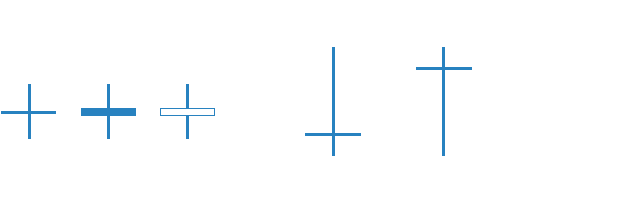
Doji is an important facet of the candlestick chart as they provide information in a number of candlestick patterns. These form when the instruments open and close prices are virtually equal and there’s not much price difference. The relevance of Doji candles are to show traders that after a long green candlestick the buying pressure is starting to weaken, or after a solid red candle that the selling pressure is starting to decrease and the supply and demand are starting to even out.
Graphical Analysis
There are a variety of patterns you can identify just by looking at the chart. The nature of chart patterns is based on the fact that human psychology does not easily change and therefore history tends to repeat itself. Chart patterns demonstrate the psychology of the financial markets and under the assumption that chart patterns worked in the past, so too will they work in the future. They give you clues as to the potential direction the trend will follow. They are at the heart of all important price moves that form a connection between trends. You can use chart patterns as a self-contained technical strategy for your trading.
Some of the most important patterns to know include Triangles, a continuation pattern which shows a battle taking place between a rising and falling price. This means the price is eventually expected to continue in the direction it was travelling before the pattern was identified. Another key pattern to know is the double top, which shows the price making two highs and indicates a reversal in the bullish trend to a bearish trend. Its converse – the double bottom – identifies a trend reversal from bearish to bullish, meaning an impending uptrend. From these examples you can understand just how important being able to identify patterns is to your trading outcome.
Using Indicators and Studies in your Charts
As you get more comfortable reading charts, you may start using technical indicators to gain even more insight into the current price action of an asset and to measure the rate of market volatility as well as the changes in the value. Technical indicators are mathematical tools that help to put past and current price action into context so that traders can predict possible future price direction. These indicators also help one to learn when markets are ‘oversold’ or ‘overbought’ and if a reversal is imminent. There are numerous types of indicators, and they help traders to understand different types of price elements such as trend, momentum, volatility, volume, and market cycles.
Trend indicators help traders to identify and take advantage of opportunities in trending markets. An example is Moving Averages, whose slope and direction reflect the trend direction as well as its momentum. Momentum indicators such as RSI, the MACD, and Stochastics are also known as oscillators. They help traders to establish overbought and oversold conditions in the market. For instance, using Stochastics, a reading of above 80 implies overbought conditions and traders will look to sell; whereas a reading of below 20 implies oversold conditions and traders will look to buy the underlying asset.
Volatility indicators, such as ATR and Bollinger Bands, help traders measure the rate of price fluctuations in an underlying asset. This can help traders to filter out which markets to trade with an appropriate strategy. For instance, a risk-averse trader will look to trade low volatility markets or to utilize low stake amounts in high volatility markets. As an example, Bollinger Bands converge when there is low volatility, and they diverge when there is high volatility.
Volume is an important price element. Traders watch the volume behind a price movement to determine if it’s backed by conviction or lack thereof. A volume-backed movement is considered valid and tradable, whereas a movement backed with low volume is considered fake and unsustainable.
Market cycle indicators, such as Elliot Waves, help traders to anticipate the various phases of price development including the rise, peak, fall, and trough. Traders using market cycle indicators also have the advantage of an incorporated time element. This means that they can not only predict where the price can potentially change but also ‘WHEN’. There are numerous indicators available on various trading platforms. Despite this, it is important not to clutter your charts or use too many indicators which can lead to decision paralysis or information overload.
For instance, there is no need to use both Stochastics and RSI, because they are both momentum indicators delivering similar signals – using only one will suffice. It is also important to utilise complementary indicators, which support each other. For instance, you can use Moving Averages (trend indicator) together with RSI (momentum indicator) to pick out potentially lucrative opportunities in a trending market.
Understanding Price Chart Timeframes
A trading chart basically displays the price information of an underlying asset over time. Price is the primary factor of the trading chart and is usually graphically represented on the vertical or y-axis. There are usually different approaches to representing the information on the horizontal or x-axis. Most platforms utilize a linear or arithmetic model that represents time in equal intervals (price bars are printed after a specified amount of time has elapsed). But there are also tick and volume charts. Tick charts print the price based on a certain number of transactions that have been performed in the market. For instance, a 1000 tick chart will print the price after every 1000 transactions. A volume chart basically reflects the volume behind any price level of an underlying asset. This is very important in gauging the buying or selling interest elicited by market participants at any particular price point.
Time charts are by far the most popular price charts among investors. The timeframes represented range from 1-second to monthly trading charts. Different timeframe charts support efficient price analysis of different trading styles. Monthly and weekly charts are usually used by long-term position traders who seek to take advantage of price changes over a longer period. The time horizon can range from several months to a few years. This type of trading is generally popular with institutions or high net worth individuals who pursue gradual, stable returns over time.
Daily charts are typically used by traders who are seeking to implement swing-trading strategies. These strategies seek to gain the bulk of profits over significant short to medium price changes in the markets. The time horizon for swing trades ranges from a few days to a few months. Swing traders can also use week charts as a long-term guide to their trading bias. Intraday charts are usually used by traders who seek to gain profits over a short period. Intraday trades are entered and exited within the same trading session or day. They are typically not held overnight. Day traders usually use 1-hour to 4-hour charts to guide their trading ideas. Day trading positions are usually held for several minutes to a handful of hours. Scalpers, though, can be even more aggressive and often use 1-minute to 15-minute trading charts. Scalpers seek tiny profits which can be captured within several seconds or a few minutes.
How to read trading charts main FAQs
- What information is on a trading chart?
Traders use a variety of indicators to read a trading chart, but at its core it contains two vital pieces of information – price and volume. Anything else besides the historical price and volume information is nothing more than speculation. And yet these two pieces of information are vitally important to forecasting future market moves. Changes in volume are often overlooked, but increasing volume shows a much stronger move, one that’s likely to continue, while falling volume shows a lack of conviction among traders.
- What should I be looking for on the trading chart?
The very first line that most technicians plot when considering a trading chart is the trend line. Of course, markets are not always trending and you might not see an obvious trend line. You might need to look at a wider time frame to distinguish what the trend is. A close kin to the trend line are the support and resistance levels, and these might be the next thing you look for on your chart. Again, it can make sense to zoom out, where you might discover long-term support and resistance levels that can be extremely important.
- What is the most important indicator when reading a trading chart?
It’s difficult to pinpoint the most important indicator on any chart. Certainly, the trend line and support/resistance levels are something that’s critically important, and some traders who rely on these levels when trading would consider them to be the most important. As far as indicators, the moving average in all its different time frames may be the most important indicator simply because so many traders are using them to base trades off of, particularly the 50 and 200 period moving averages.
Join AvaTrade today, and become the trader that you were meant to be.
Learn and empower yourself to trade with confidence.
We recommend you to visit our trading for beginners section for more articles on how to trade Forex and CFDs.
Other recommended guides: